
KatieHunt
KatieHunt
I designed and built Digital Trading Playbook, a local-first application for discretionary traders who need a single, structured library for their strategy "plays" — rules, context, risk notes, and tags — without handing that data to a third-party SaaS. The product covers every surface from lock screen to play editor, from indicators to notes with file attachments, with two deliberate visual modes: a classic desk interface for daily workflow and a futuristic immersive dashboard for demos and brand presence.
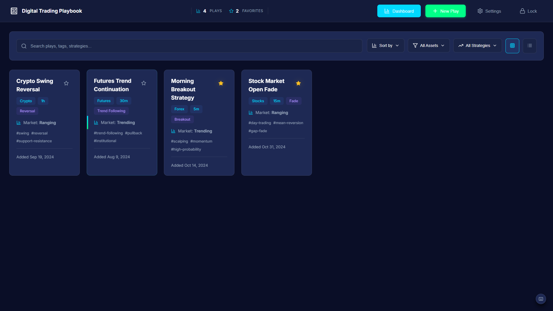
Dashboard — the primary daily surface: stats bar, search, filters, and the strategy play library.
End-to-end flows for discovering, filtering, viewing, creating, editing, duplicating, and deleting plays. Auxiliary workflows for notes, indicators, todos, favorites, and settings — with confirmations, toasts, breadcrumbs, and keyboard shortcuts.
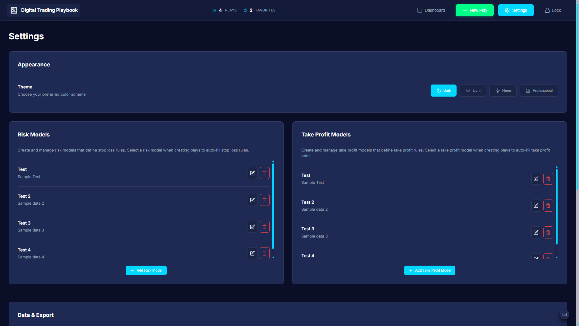
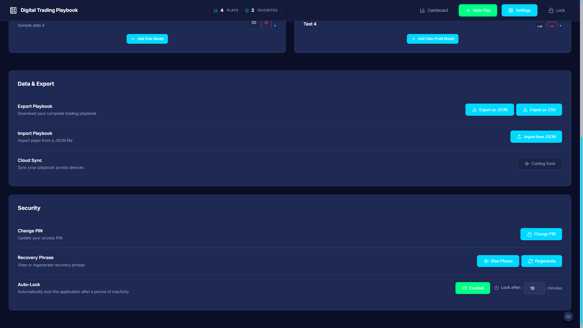
Multi-theme experience (Dark, Light, Neon accent modes). Two UI styles — classic desk mode and futuristic immersive mode. CSS-first animation, responsive breakpoints from desktop to stacked mobile layouts, and grid/list view toggles with persistent state.
Modular React 18 codebase. Context for app, theme, UI style, typography, and layout. Service layer for persistence (debounced saves), PIN/auto-lock, tags, search, and domain modules. Lazy-loaded heavy routes. react-window virtualization for large libraries.
Electron desktop build (Windows) using electron-packager — chosen for reliable output on environments where electron-builder hits symlink/code-sign archive issues. Same React UI runs in both web and desktop contexts.
The brief was personal: replace scattered notes and spreadsheets with a single, credible, offline-first system for managing trading strategies — the kind of "institutional-grade" interface that makes the work feel as serious as the market discipline it supports.
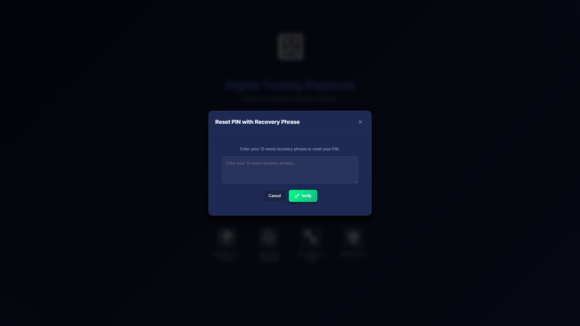
Non-negotiable constraints: Data stays on device. PIN is experience-level gating, not bank-grade authentication. The Electron Windows build had to avoid toolchains that fail on symlink/code-sign archive extraction — which meant choosing electron-packager over electron-builder for reliable output on this machine.
Early structural priorities: One scannable library (search + sort + filters + grid/list), a single deep editor for the play record, and clear save feedback — because silent failure is unacceptable when you're documenting live trading rules.
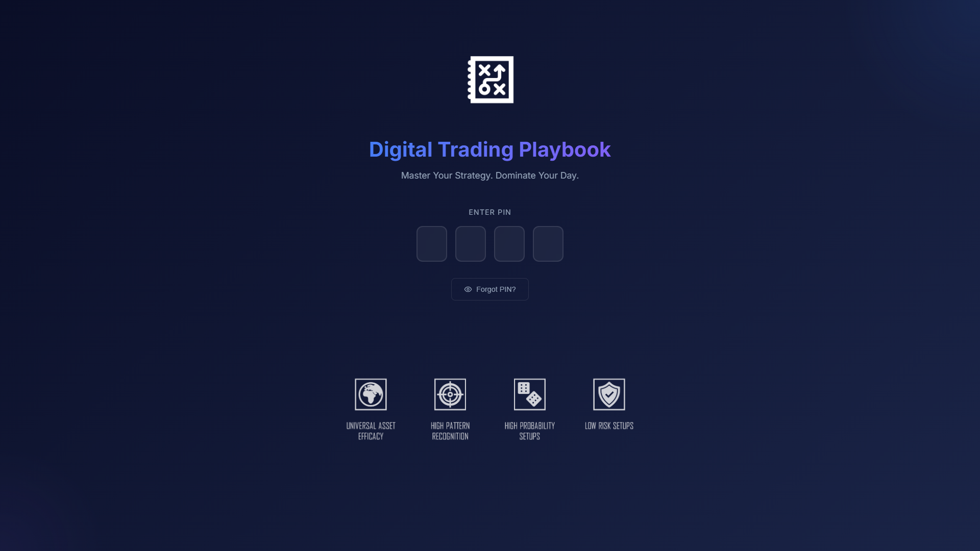
Lock screen — PIN entry with auto-lock; sets the "serious tool" tone from the first interaction.
Brand intent: Credible and institutional when traders are working — high contrast, predictable controls, badge-based metadata. But capable of a second read that feels futuristic and demo-ready, without replacing the CRM-like clarity of the primary library.
Density, legibility, stat chips in navigation, minimal distraction. Optimized for repeat use and long sessions — where traders spend hours reviewing and editing plays. Controls are predictable; nothing competes with content.
Atmospheric shell and ambient motion. Optimized for onboarding, screenshots, and presentations — while routing users back into the same underlying components. Same data, elevated staging.
The two modes share every data store, routing logic, and business component — the only fork is the shell wrapper and its CSS animation layer. This ensures mode switching never causes a data inconsistency and the futuristic experience never needs its own maintenance path.
Stats bar + filter band + play grid. Information-dense, optimized for scanning and daily use. Controls stay in the same place every session.
Atmospheric background, ambient motion, ticker. Demo-ready and brand-forward — same underlying play data and components, different visual shell.
The hardest daily task for a trader with a large library isn't creating a play — it's finding the right one quickly before or during a trade. This is the feature where friction has real cost.
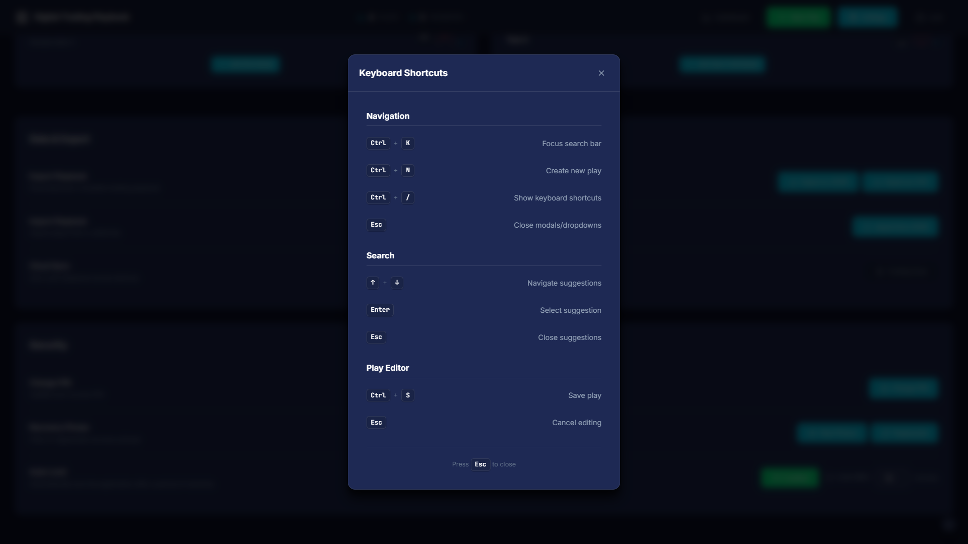
Keyboard shortcuts overlay — every primary action accessible without the mouse; discoverable but non-intrusive.
I evaluated the flow against three primary tasks using heuristic analysis and extended self-testing across a realistic play library. Each finding drove a direct design or implementation change.
| Issue | Severity | Evidence | Fix applied |
|---|---|---|---|
| Filter controls competed with search for first attention | High | Eyes tracked to filters before search on first visit | Search anchored to far-left; filters follow in priority order |
| Strategy filter label unclear — "type" vs "strategy" | Medium | Hesitation on dropdown; mismatched mental model | Label updated; tooltip added on hover |
| Sort default ("newest") not obvious from label alone | Medium | Users sorted manually to verify default | Added active sort indicator chip; default labeled explicitly |
| List view felt redundant, not useful | Medium | Grid switched back to immediately in most sessions | List view redesigned with consistent metadata columns for side-by-side comparison |
| View mode reset on navigation back to dashboard | High | Repeated frustration when returning from play detail | View/sort/filter state persisted in context and saved to localStorage |
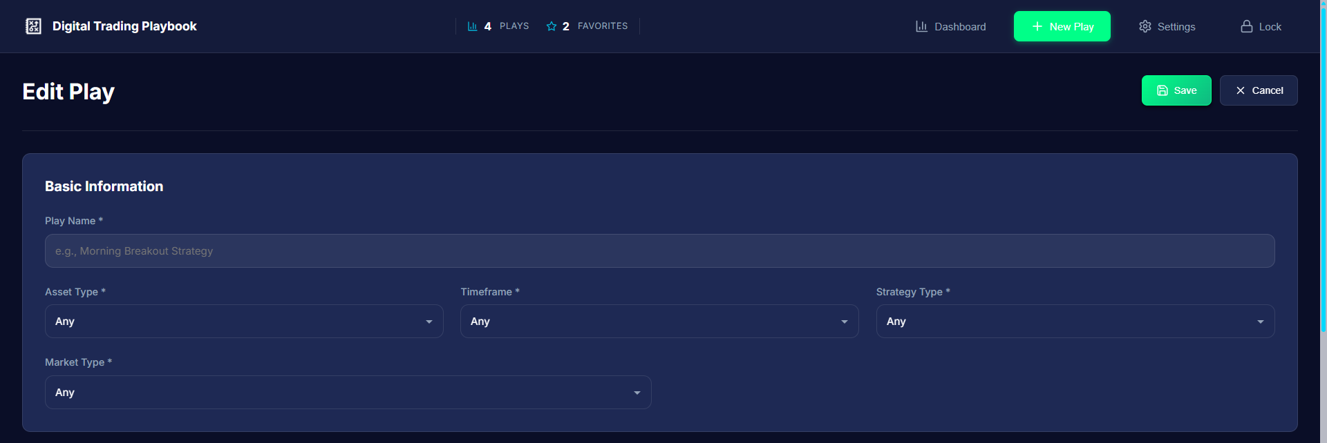
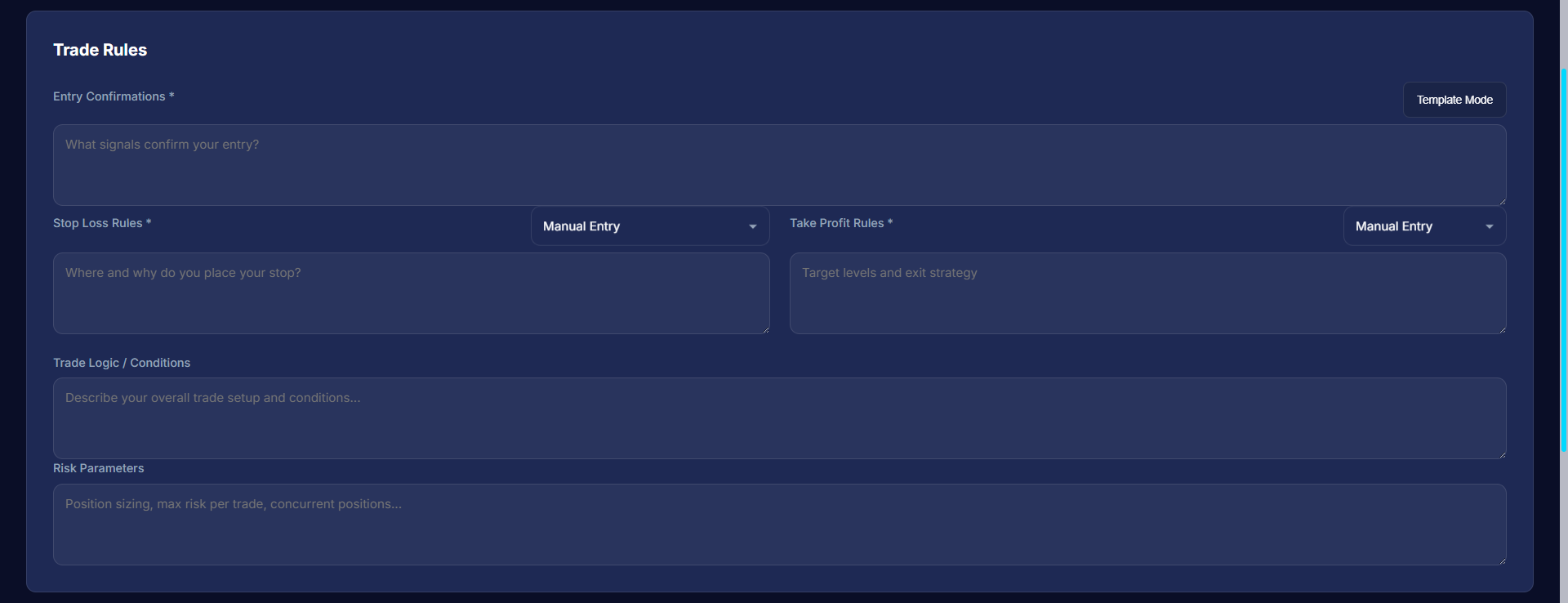
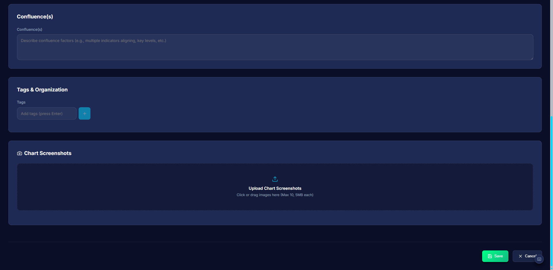
The play editor needed to be structured enough to enforce consistency across entries, but flexible enough for different strategy types. The form is grouped into logical blocks: identity (name, asset, strategy), rules and logic, risk parameters, notes, and tags. Destructive actions (delete, archive) are gated behind confirmation dialogs.
All screens use synthetic / representative data only. Dark mode is default; Light and Neon themes available via Settings.
The implementation maps visual intent to theme variables and shared CSS, composed with Tailwind utilities. React context propagates theme, UI style (classic vs futuristic), and typography globally — so changing mode never requires a page reload or re-initialization.
Digital Trading Playbook shipped as a complete, interactive system — not a mock — with persistent storage (localStorage plus IndexedDB for larger datasets and file metadata), virtualized lists for scale, and a deliberate split between information-dense trading workflows and a show-floor visual mode for demos and brand presence.
The project demonstrates the design-to-delivery arc that defines my work: product thinking (what belongs in a personal knowledge management system for traders), UX decisions (filter architecture, session lifecycle, dual-mode design), visual craft (institutional density vs immersive brand), and front-end engineering (React context, IndexedDB, virtualization, Electron packaging).
Next priorities:
What I learned: