
KatieHunt
KatieHunt
I designed and built CryptoVault end to end—from product concept and UX through UI craft and front-end implementation. The result is a high-fidelity crypto wallet spanning dashboard, portfolio, history, security, and preferences, with realistic core flows (send, buy, receive, swap, and export-style journeys) while staying a self-contained front-end: no blockchain backend required for the presentation build.
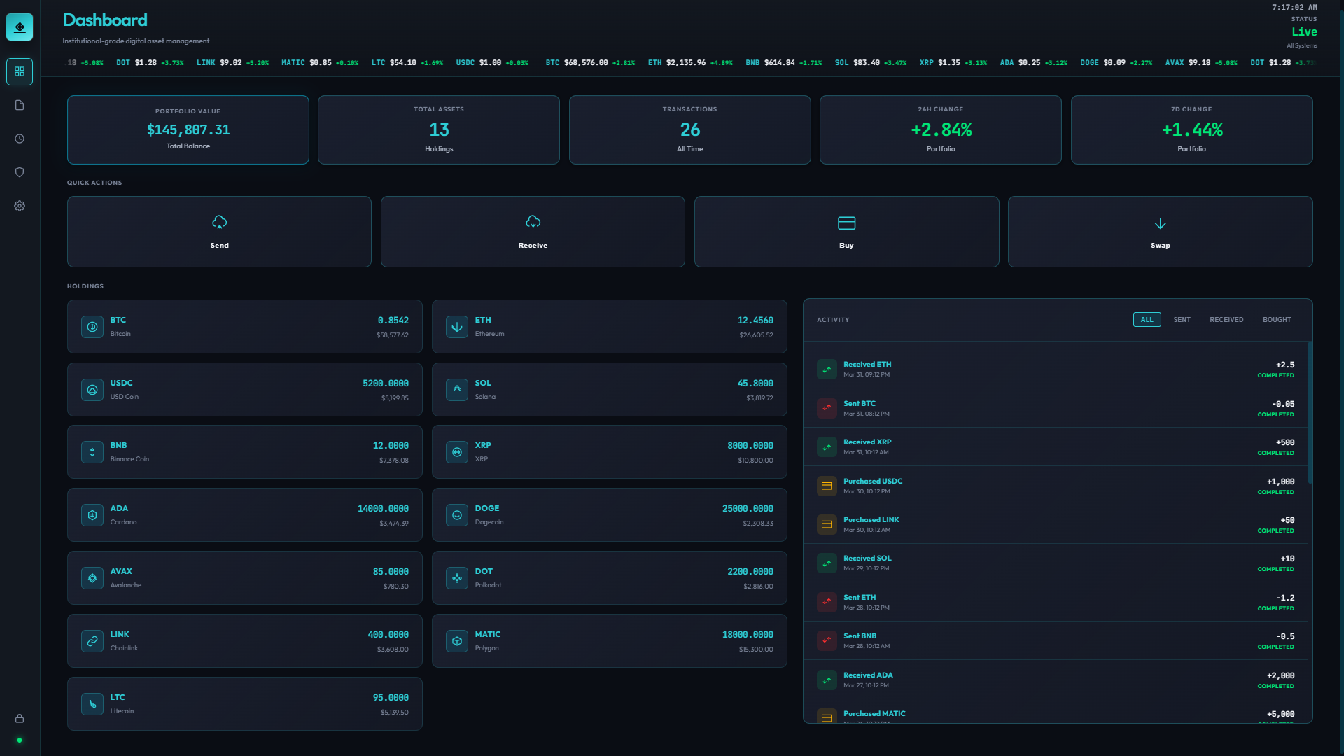
Balances, quick actions, and primary entry into send, receive, and portfolio workflows.
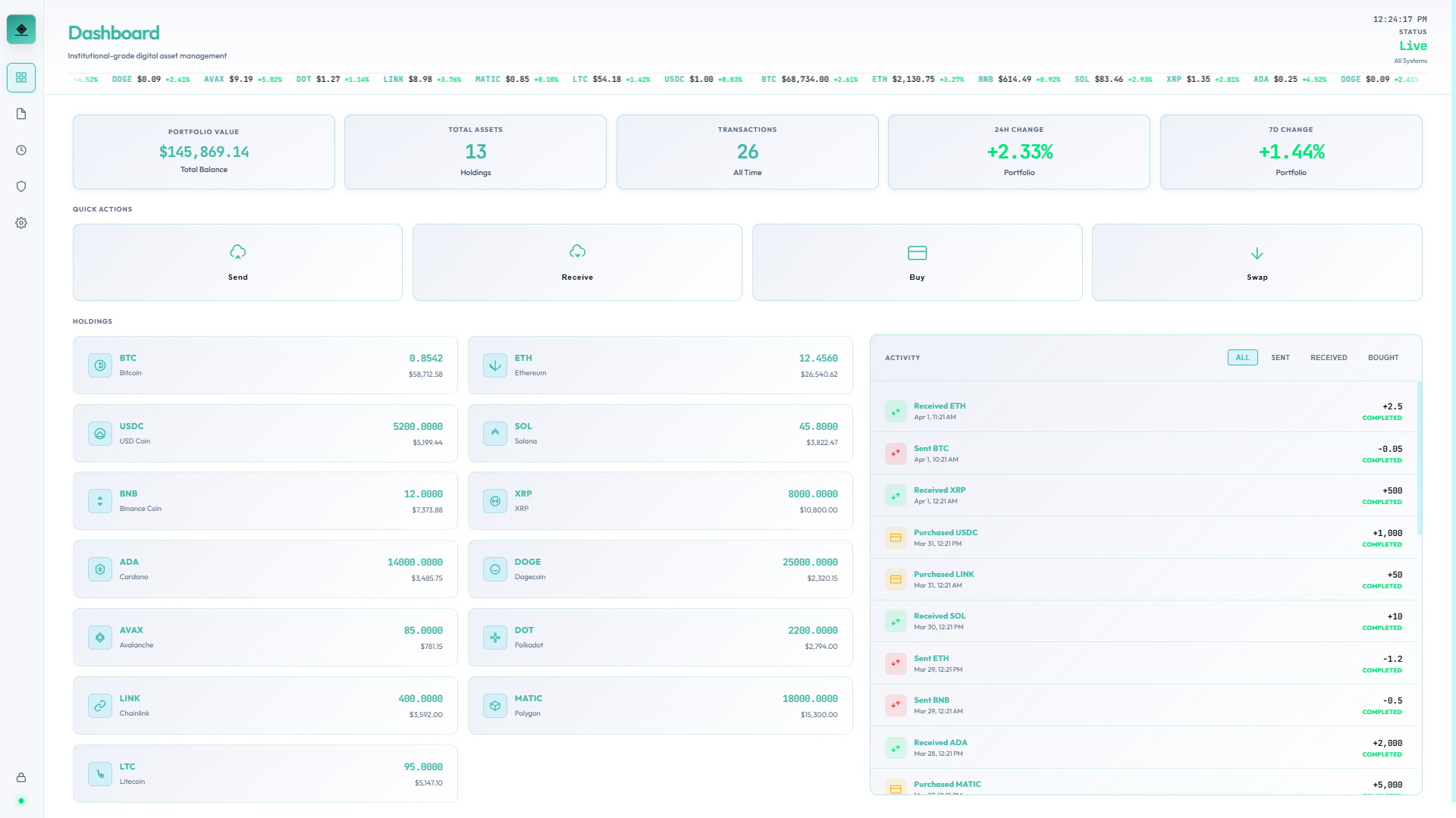
Same layout and tokens on light surfaces for daytime use and accessibility preferences.
Dashboard — dark and light variants; light screens live alongside dark ones with an LT.png suffix (spacing matches your export names).
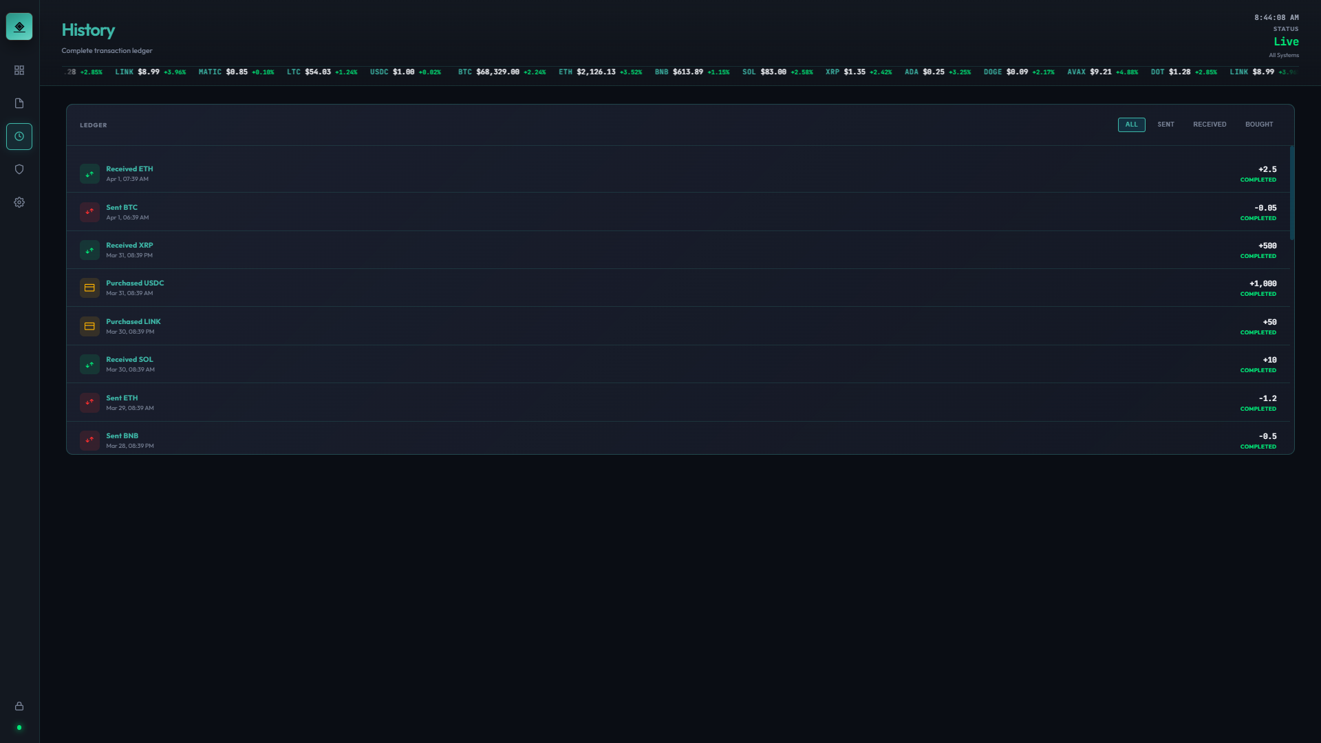
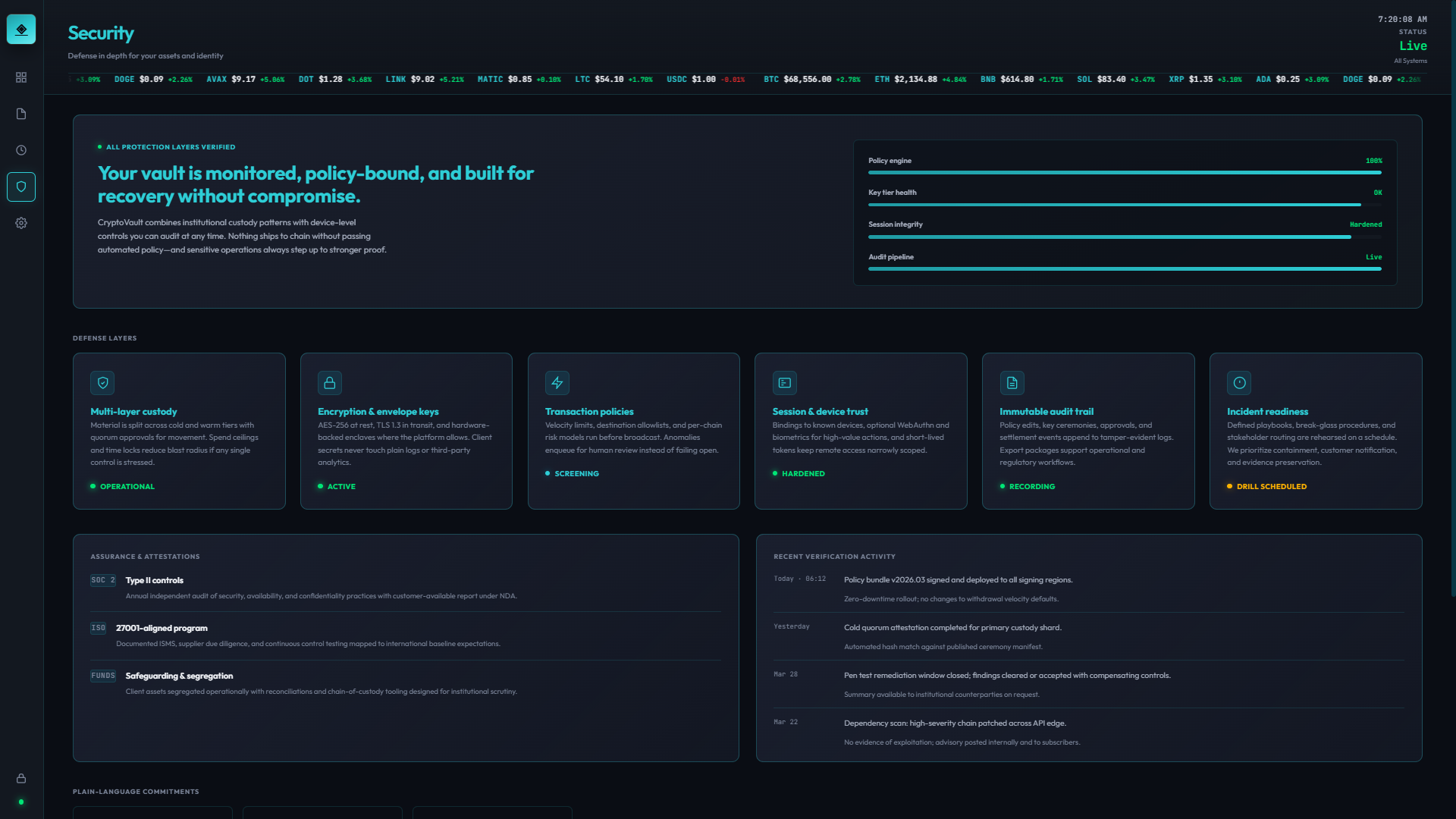
Wallet-native information architecture: lock gate, dashboard home, portfolio and position context, history, a dedicated security area, and a deep settings system—mirroring how production wallets separate money movement from configuration.
High-fidelity flows for send, buy, receive, swap, and export-style actions; legible transaction and holdings patterns; settings grouped by mental model (appearance, privacy, notifications, network, data).
React 19 with a Create React App–style setup; client-side preference persistence via localStorage; structured to ship as a static build for portfolio and docs or run inside a standard React app shell.
Synthetic data throughout; believable hierarchy and density for screenshots, walkthroughs, and case-study narrative—including repeatable capture with Playwright-driven screen passes.
I started from a portfolio goal: demonstrate end-to-end ownership—strategy, flows, UI, and build—for a product category users judge harshly (crypto wallets). The build intentionally avoids blockchain integration so the work stays focused on clarity, IA, and execution quality.
Binding constraints: synthetic data only, no live custody story, and a static-friendly front-end. Within that box, the design still had to feel like a credible wallet: lock-before-access, obvious primary actions, and settings that scale without turning into an undifferentiated list.
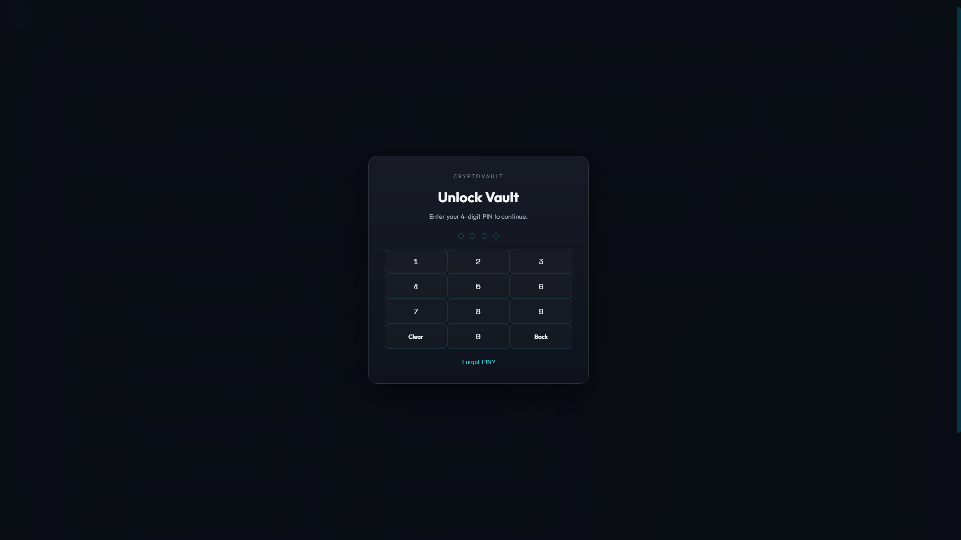
Single task with minimal chrome before any balances appear.

Same gate pattern on a light canvas.
Brand intent: "Composed custody." The wallet should feel calm on the lock screen, confident on the dashboard, and precise in portfolio and history—without cartoon gradients or noisy chart chrome competing with balances and actions.
Portfolio stays scannable at a glance; position-level surfaces add detail only when the user implies intent. Neutral structure so numerics and key actions stay the hero.
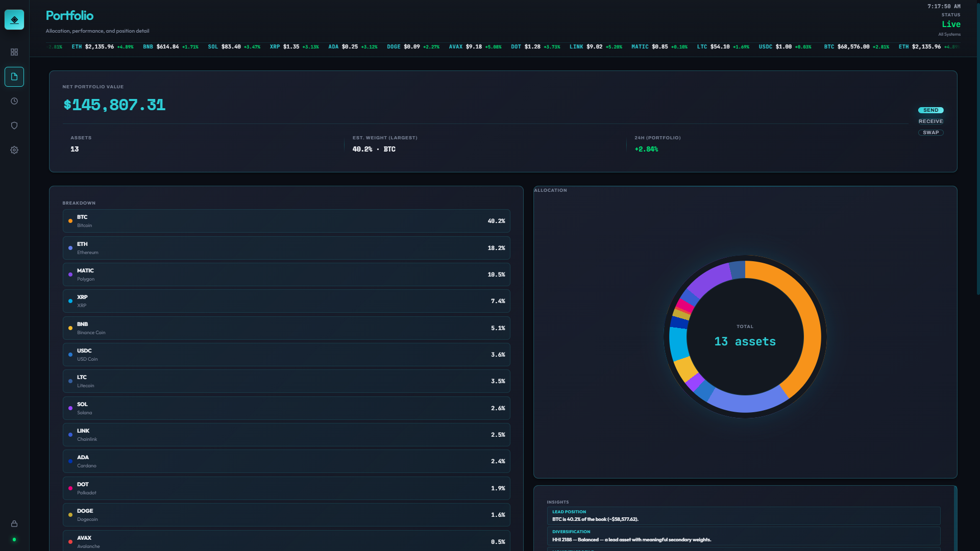
Aggregate holdings and allocation-style reads—fast orientation before any single-asset drill-in.
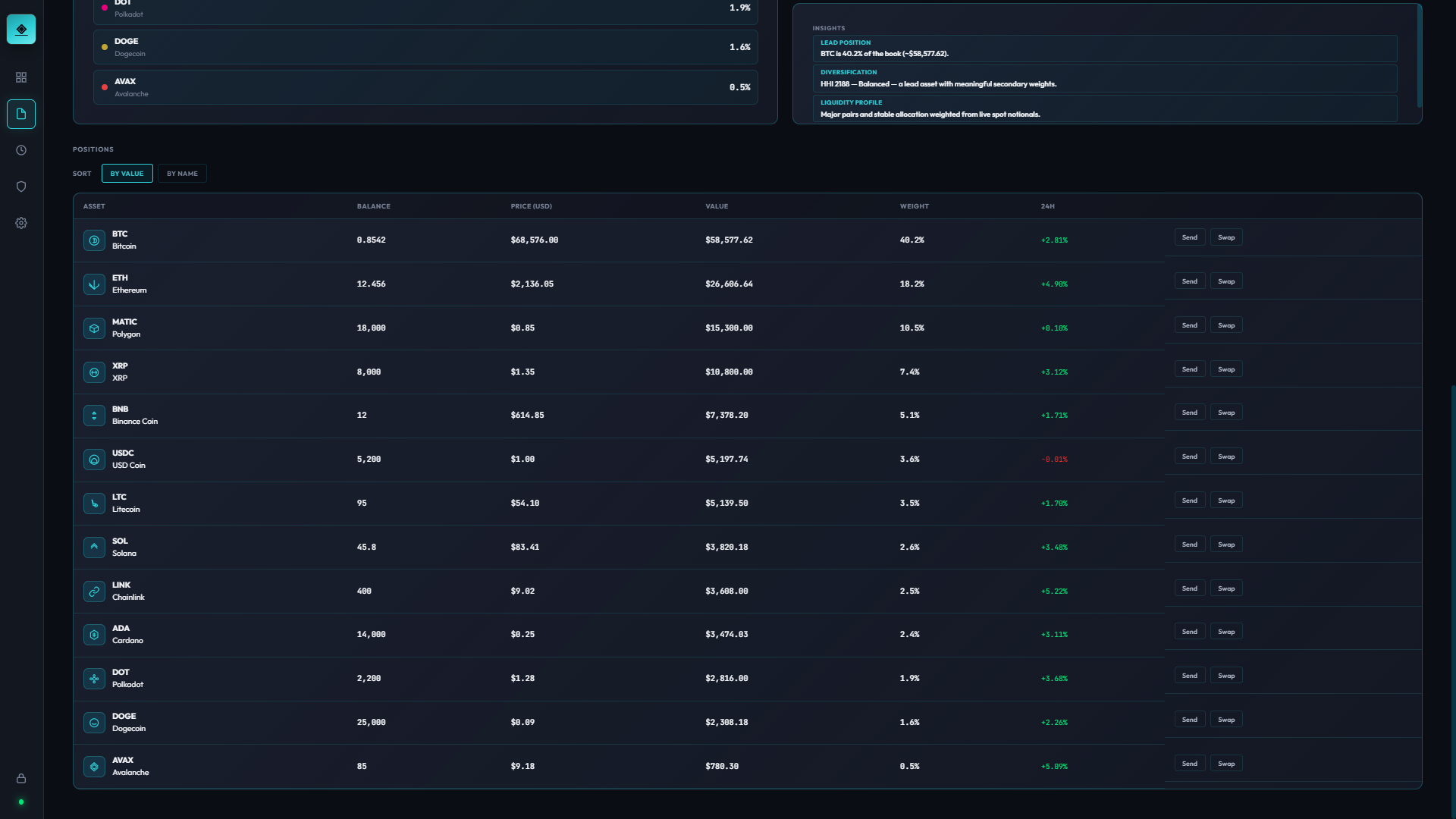
Position view adds tighter context for one asset—supporting decisions without cluttering the top-level portfolio.
Why chosen: Wallet users oscillate between "where am I overall?" and "what about this asset?"—two frequencies that deserve two layers instead of one noisy screen.
Light mode preserves the same overview vs. drill-down relationship; only the surface palette changes.

Holdings overview with the same scannable hierarchy as dark mode.

Position detail without extra chrome—still one layer deeper.
For a wallet—even missing a custodial backend—the first minute sets expectations. If lock feels flimsy or the dashboard feels like a marketing mock, the whole piece fails. This flow is where IA, motion burden, and copy matter most.
Early iterations borrowed from generic app shells—too much chrome before unlock, and the dashboard tried to show everything at once.
Each issue mapped to a concrete adjustment in layout, routing, or component reuse:
Lock screen — single task, no competing navigation.
Dashboard — orientation and primary actions immediately after access.
Lock screen (light) — same gate, light canvas.
Dashboard (light) — same action row and orientation.
I walked three tasks cold: unlock, send (modal/sheet entry), and adjust appearance settings. Friction points were adjusted in copy density, button grouping, and default scroll anchors—not net-new components.
| Task | Problem identified | Fix applied |
|---|---|---|
| Cold-start unlock | Helper text competed with the primary field | Shortened secondary copy; tightened vertical rhythm |
| Send flow | Primary CTA didn’t read as the same family as dashboard actions | Reused button tokens and spacing scale from home row |
| Appearance settings | Preview didn’t reflect state changes quickly enough in the narrative demo | Hooked theme tokens to persisted preference state for instant feedback |
Deep settings prove production intent: users expect fine-grained control for privacy, network, notifications, and data export—without losing the wallet’s calm visual system.
.png)
 LT.png)
.png)
 LT.png)
.png)
 LT.png)
All screens use synthetic data only. Dark theme in the first grid; light theme in the second (same folder; light files use an LT.png suffix on each screen).
.png)
.png)
.png)
.png)


 LT.png)
 LT.png)
 LT.png)
 LT.png)
While building screens I simultaneously built out the component library in an atomic structure, so each new surface could compose from existing parts rather than inventing new ones.
Theme and density are centralized via CSS variables, making dark/light switching a single attribute toggle — the same pattern used on this portfolio.
CryptoVault is a portfolio-grade wallet experience: coherent IA, believable flows, and a full settings matrix—without claiming custodial or on-chain behavior. The hardest integration win was keeping presentation fidelity aligned with a realistic product narrative while staying within static, front-end-only constraints.
The piece demonstrates design-to-build ownership for a skeptical category: product framing, UX for money movement, visual system discipline, and React implementation (including tests and documentation-oriented capture).
Demonstration build with synthetic balances and transactions. No wallet keys, chain RPC, or custody logic—by design—so the artifact stays safe to host and iterate as a portfolio piece.
User-facing preferences (appearance, toggles, and similar settings) persist via localStorage so revisits match the documented state used for screenshots and walkthroughs.
React 19 on a Create React App–style toolchain; component tests with Testing Library and Jest where they add confidence for interactive flows and regression safety.
Structured for a static production build suitable for GitHub Pages–style hosting and for embedding in case-study media; Playwright can drive repeatable screen capture for docs.